Modern Logo Design Best Practices for Small Businesses
Your logo is often the very first thing a potential customer sees — and in a split second, it communicates who you are, what you stand for, and whether you're worth a second look. That's a lot of pressure for a small graphic. The good news? A well-designed logo doesn't need to be complicated. It just needs to be intentional.
Modern logo design has evolved significantly over the past decade. The days of drop shadows, gradients, and overly decorative marks are behind us. Today's best-performing logos are clean, versatile, and built to work everywhere — from a social media profile picture to a billboard. If you're thinking about a new logo or wondering whether your current one is holding your brand back, this guide is for you.
We'll walk through the core principles of modern logo design, how to make sure your logo truly reflects your brand, what versions you need, and where each one belongs. Whether you're starting from scratch or refreshing what you have, these best practices will help you make smart decisions.
1. Start with Your Brand Identity — Not the Logo
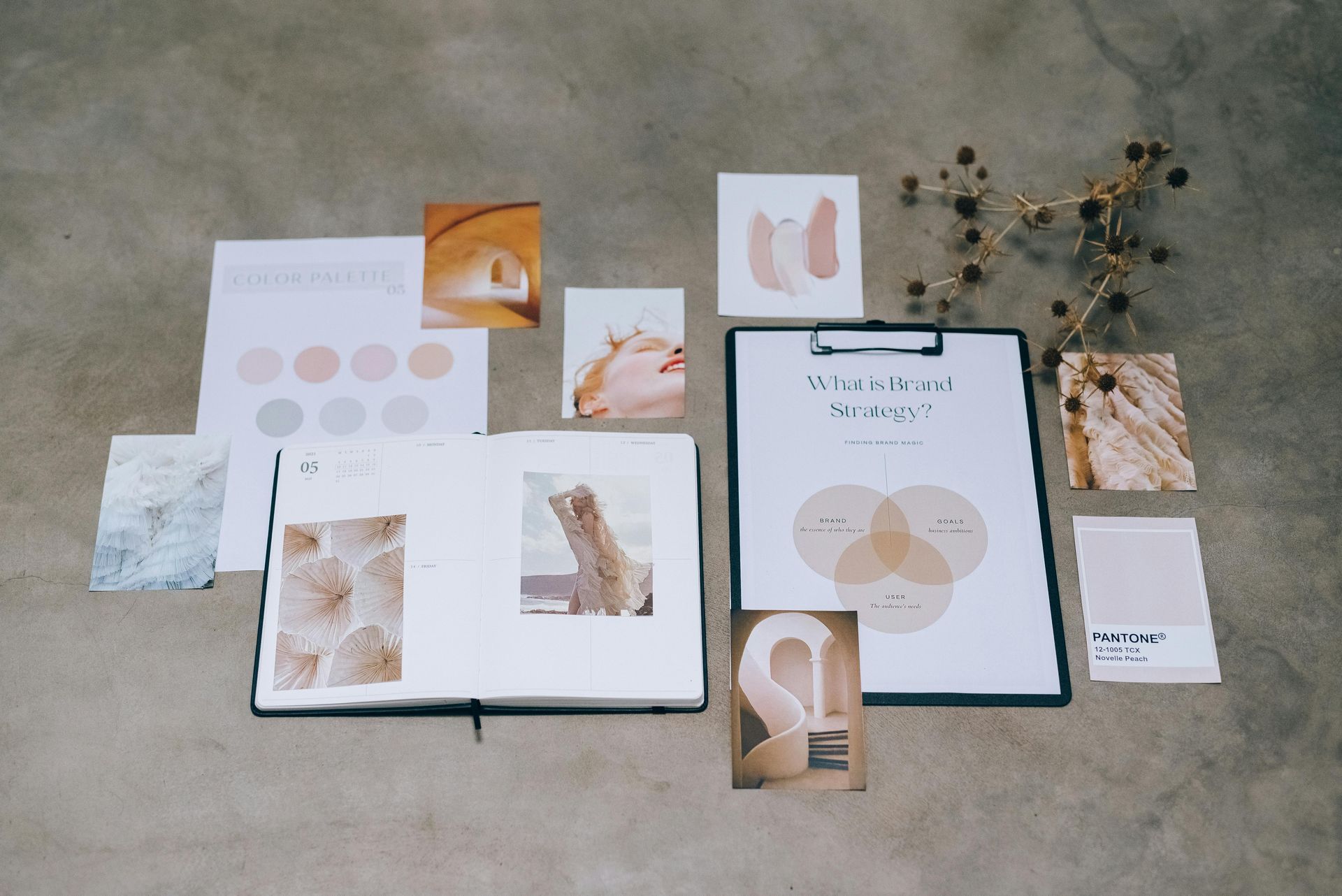
The biggest mistake small businesses make is jumping straight to the logo before they've clearly defined what their brand actually stands for. A logo is a symbol of your brand — which means if you don't know your brand yet, you can't design a good logo for it. Before any design work begins, get clear on a few foundational questions: Who is your ideal customer? What feeling do you want your business to evoke? What makes you different from your competitors?
Your brand personality should directly inform your logo's visual style. A playful children's brand calls for rounded shapes, bright colors, and a friendly typeface. A law firm or financial advisor needs something that reads as serious, trustworthy, and established — think clean lines, classic serif fonts, and a restrained color palette. A modern wellness brand might lean into soft, organic forms and muted earth tones. None of these is objectively "better" — the right choice is the one that matches who you are and who you're trying to reach.
It also helps to do a quick competitive audit before designing. Look at the logos of businesses in your space. You want to fit into your industry enough to feel credible, but stand out enough to be memorable. If every competitor uses navy blue and a sans-serif font, you might have an opportunity to differentiate — or you might choose that style deliberately because it signals professionalism to your audience. The point is to make that choice consciously, not accidentally.
Once you've defined your brand personality, you can brief a designer — or approach a DIY tool — with real direction. "I want something modern and clean that appeals to health-conscious women in their 30s who value simplicity" is infinitely more useful than "I want a nice logo." The more specific your brief, the more likely you'll get a result that actually works.
2. Keep It Simple — Seriously
Simplicity is the defining characteristic of virtually every enduring logo. Think of the brands with the most recognizable logos in the world — most of them are deceptively simple. A clean wordmark, a single iconic shape, a clever use of negative space. What they all have in common is that they're immediately recognizable and easy to remember. That recognition is built through consistency over time, but it starts with a design that's simple enough to stick.
For small businesses especially, simplicity is your friend. You probably don't have a massive advertising budget to burn your logo into people's memories through sheer repetition. That means your logo needs to do more work on its own — and a clean, distinctive mark does that far better than something cluttered with details. Complicated logos also suffer at small sizes: the intricate design that looks beautiful at full scale becomes an unreadable blob on a mobile screen or a favicon.
A good rule of thumb: your logo should be recognizable when it's just one inch wide. If you can't make that work, it's time to simplify. This usually means removing decorative elements that don't add meaning, reducing the number of colors, or rethinking a typeface that only works at large sizes. Every element in your logo should earn its place — if you can remove something and the logo still communicates the same thing, remove it.
This doesn't mean your logo has to be boring. Simple and bland are very different things. A single bold geometric shape can be striking and distinctive. A well-chosen wordmark in the perfect typeface can carry enormous personality. The goal is to be memorable with as few elements as possible — not to drain all character out of the design.
3. Choose Colors That Work Hard for You
Color is one of the most powerful tools in your logo — and one of the most commonly misused. Color triggers emotional responses before the brain even processes what it's looking at, which means your color choices are quietly communicating something to every person who sees your brand. It's worth being intentional about what you're saying.
Different colors carry different psychological associations, though these can vary by culture and context. Blues tend to communicate trust, stability, and professionalism — which is why you see them so often in finance, tech, and healthcare. Greens evoke nature, health, and growth. Warm tones like orange and yellow suggest energy, optimism, and approachability. Black and charcoal read as sophisticated, premium, and authoritative. These associations aren't absolute rules, but they're worth factoring into your decisions.
For most small business logos, less is more when it comes to color. A one- or two-color palette is almost always easier to work with than three or more colors. Simpler palettes reproduce better across different media, look more cohesive, and are less likely to create problems when you need to print on colored materials or embroider on fabric. Your logo should look equally strong in full color, one color, and black and white — because there will be situations where you need each of those versions.
When you finalize your logo colors, make sure you have the exact color values in every format you'll need: HEX codes for web and digital use, RGB values for screen applications, CMYK values for print, and Pantone (PMS) codes if you'll be doing professional printing or branded merchandise. Your brand colors should be documented precisely and used consistently — not approximated from memory every time you need them.
4. Understand the Types of Logos and When to Use Each
Not all logos are the same. There are several distinct types of logo formats, and understanding them will help you know what you actually need and how to deploy each one strategically. Most mature brands use multiple types in different contexts, and having the right one for each situation makes a significant difference in how polished and professional your brand looks.
A wordmark (or logotype) is simply your business name set in a distinctive typeface, often with custom lettering or styling. Google and Coca-Cola are classic examples. Wordmarks work well when your business name is short, distinctive, and memorable. They're especially effective for new businesses that are still building brand recognition — every time someone sees the logo, they're also seeing and learning your name.
A lettermark uses initials rather than the full name — think IBM or HBO. These work when your business name is long or complex, or when your initials are already recognizable. They're compact and versatile, but they're harder to establish with a new audience because people need to already know what those letters stand for before the logo does its job.
A brand mark (or pictorial mark) is a standalone graphic symbol — an icon that represents your brand without any text. The Apple logo and the Twitter bird are famous examples. This is the most powerful type of logo in terms of recognition, but it requires years of consistent brand-building before the symbol alone can carry meaning. For a new small business, relying solely on a brand mark is usually premature.
A combination mark pairs a symbol with a wordmark, and it's the most versatile and practical choice for most small businesses. You have the full logo (symbol + name) for primary use, and you can use the symbol alone once it becomes recognizable. This gives you flexibility as your brand grows without having to redesign your logo.
An emblem integrates text and imagery within a contained shape or badge — think coffee shop crests, vintage-style seals, or sports team logos. Emblems can look distinctive and established, but they're less flexible at small sizes and can be harder to reproduce cleanly in all contexts.
5. Build Out All the Versions You Need
One of the most common gaps in small business branding is treating the logo as a single file rather than a system of versions. In reality, your logo needs to work in a wide range of contexts — some wide, some square, some tiny, some enormous — and a single version rarely handles all of them gracefully. Building out a proper logo suite from the start saves you from scrambling later.
At minimum, most businesses need a primary logo (the full combination of symbol and wordmark), a secondary or horizontal version if the primary is stacked vertically (or vice versa), a standalone icon or symbol for use at small sizes or in square formats, and a wordmark-only version for contexts where a symbol would be redundant or too small. Each of these should be delivered in color, one-color, reversed (white on dark), and black and white variants.
You'll also want your logo in the right file formats for each use case. SVG and EPS are vector formats that scale infinitely without losing quality — these are essential for print and are the "master" versions of your logo. PNG files with transparent backgrounds are what you'll use most often in digital applications — website headers, email signatures, social media posts. JPG is useful when a flat background is fine. PDF is often requested by printers and vendors.
A note on favicon and app icon versions: these are tiny — often just 16x16 or 32x32 pixels — and most logos simply don't work at that size without simplification. If your logo has fine detail, a thin wordmark, or multiple elements, you'll need a simplified version specifically for favicon and app icon use. Often this is just the first letter of your business name or a simplified version of your icon, designed to be clearly recognizable at a tiny scale.
6. Where to Use Each Logo Version
Having a full logo suite is only useful if you know how to deploy each version correctly. Using the wrong version in the wrong context is one of the most common ways small business branding starts to look inconsistent or unprofessional — not because the logo is bad, but because it's being used in a way it wasn't designed for.
Your primary logo belongs in places where you have space and want to make the strongest brand impression: website headers, proposals, presentations, marketing materials, and signage. This is your "hero" version — use it when you have room to let it breathe. Your horizontal or stacked variant should be used based on the orientation of the space you're filling. If the layout is landscape and wide, use horizontal. If it's more vertical or square, use a stacked version.
Your standalone icon is what you'll use for social media profile pictures, app icons, favicons, small embroidery, watermarks on photos, and anywhere space is tight. It should be immediately recognizable as your brand without needing the wordmark to support it. Your reversed or white version is for dark or colored backgrounds — on colored merchandise, dark-background email headers, or overlaid on photos. Using a dark logo on a dark background looks like an oversight; having the right reversed version prevents that.
On social media specifically, your profile image will almost always be displayed in a circle — so make sure your icon version looks intentional and balanced in that cropped format. And across all platforms, consistency matters: use the same version, the same colors, and the same proportions everywhere. Small inconsistencies compound into a brand that feels scattered.
7. Use Typography and Spacing Intentionally
If your logo includes a wordmark, the typeface you choose is doing a significant amount of brand communication on its own. Typefaces carry personality — a rounded sans-serif reads very differently than a sharp geometric one, which reads differently than a classic serif. The font in your logo should feel consistent with your overall brand voice and with the fonts used throughout the rest of your brand.
Avoid using generic, overused system fonts (think Comic Sans, Papyrus, or unmodified Arial) in your logo. These fonts don't communicate professionalism, and they don't differentiate you from anyone else. At the same time, resist the urge to choose something so unusual it's hard to read — legibility is non-negotiable. The best logo typefaces are distinctive enough to feel intentional, but clean enough that they're immediately readable at a variety of sizes.
Spacing matters too — and it's often overlooked. Letter-spacing (kerning) between individual characters, and the spacing between your icon and your wordmark, have a significant impact on how polished the logo looks. Tight, thoughtful spacing communicates precision and care. Uneven or default spacing tends to look unfinished. If you're working with a designer, make sure they're treating kerning and spacing as intentional design decisions, not afterthoughts.
Finally, once your logo is finalized, define a clear exclusion zone — a minimum amount of space that must be maintained around the logo at all times. This prevents other elements from crowding the logo and ensures it always has room to be seen clearly. Most brand guidelines define this as equal to the height or width of a specific element in the logo (often the icon). Including this in your brand documentation helps anyone who uses your logo — whether it's a vendor, a web developer, or a social media manager — use it correctly.
Conclusion
A great logo isn't just a good-looking image, it's a strategic asset that works across every touchpoint of your business. When it's built with intention, deployed in the right versions, and used consistently, it becomes the visual anchor of a brand people recognize and trust. The investment in getting it right — whether you're starting fresh or finally formalizing a brand that's grown beyond its first logo — pays dividends every time a potential customer encounters your business.
At Divscape, we build brand identities that are designed to work in the real world — on your website, on social media, in your marketing materials, and everywhere else your business shows up. Our branding packages include logos, color palettes, font pairings, and the guidance to use them consistently. If you're ready to build a brand that actually reflects the quality of your work, explore our branding services or book a free consultation to talk through what you need.
Recent Posts