How to Make Your Brand Stand Out
Your brand is more than a logo. It's the full impression your business makes every time someone encounters it — on your website, in their inbox, on a brochure, in a social media post, or on a presentation slide. When that impression is consistent, polished, and intentional, it builds trust. When it's scattered and inconsistent, it quietly undermines your credibility, even if the underlying product or service is excellent.
The good news: you don't need a big agency budget to build a brand that looks and feels professional. You need a clear system — a defined set of visual elements that you apply consistently everywhere. This checklist walks you through how to build that system from the ground up, step by step.
1. Define What Your Brand Should Feel Like
Before you pick a single color or font, get clear on the impression you want your brand to make. Visual decisions — color, typography, imagery, layout — all communicate something. If you make those decisions without intention, they'll communicate something random. If you make them deliberately, they'll work together to tell a consistent story.
✅ Write down 3–5 words that describe how you want your brand to feel. Think about how you'd want a first-time customer to describe their experience of your business. Warm and approachable? Sleek and modern? Bold and energetic? Established and trustworthy? These words become your filter for every design decision going forward. If a color palette or font doesn't fit your words, it doesn't fit your brand.
✅ Look at brands you admire and identify what you like about them. Spend 20 minutes looking at websites, Instagram accounts, and marketing materials from businesses you find visually compelling — inside and outside your industry. Save what resonates. Notice patterns: do you gravitate toward clean minimalism or rich, saturated color? Serif fonts or sans-serif? Light backgrounds or dark ones? You're building a reference point for your own aesthetic.
✅ Look at your competitors and identify what you want to differentiate from. Your brand should stand out in your space, not blend in. Look at the top competitors in your market and take note of what visual choices they've made. Then intentionally go a different direction where you can — different color family, different typographic feel, different overall energy. You want to be recognizable as part of your industry, but memorable within it.
✅ Define your target audience and think about what appeals to them visually. A brand targeting Gen Z on social media has different visual needs than one targeting C-suite executives. A children's service business should feel different from a luxury skincare line. Your brand should speak to the people you're trying to reach — not just reflect your personal taste.
2. Build Your Color Palette
Color is one of the most powerful tools in your brand's visual toolkit. It creates immediate emotional associations, makes your brand recognizable across platforms, and gives your materials a sense of cohesion. A well-built color palette isn't just pretty — it's functional.
✅ Choose a primary color that anchors your brand. Your primary color is the one that will appear most frequently across your materials — in your logo, your buttons, your headers, your packaging. It should align with the feeling you defined in step one. Blues communicate trust and reliability. Greens suggest growth and health. Oranges feel energetic and friendly. Blacks and navies convey sophistication. There are no hard rules, but the emotional associations are real — choose with intention.
✅ Build a supporting palette of 3–5 colors total. A complete brand palette typically includes: a primary color, one or two secondary accent colors, a neutral (white, off-white, light gray, or cream for backgrounds), and a dark tone for text (true black is often too harsh — a very dark navy or charcoal often works better). Your colors should work together harmoniously and provide enough contrast to be legible when layered.
✅ Use Coolors to generate and refine your palette. Coolors.co is a free, intuitive color palette generator that makes it easy to explore combinations, lock in colors you love, and adjust until everything works together. You can generate random palettes and keep hitting the spacebar until something catches your eye, or start with a color you already know you want and build from there. Save your final palette with exact hex codes — you'll use them everywhere.
✅ Record your colors as hex codes, RGB values, and CMYK values. Hex codes are used for digital applications (websites, social media, email). RGB values are used for screens and digital design tools. CMYK values are used for print. Having all three versions of each color ensures your brand looks consistent whether it's on a screen or on a printed brochure. Most color tools, including Coolors, provide all of these automatically.
✅ Test your color combinations for contrast and legibility. Beautiful colors can fail if they don't provide enough contrast when layered — light text on a light background, for example, is hard to read and fails accessibility standards. Before finalizing your palette, test your primary text-on-background combinations using a free tool like the WebAIM Contrast Checker. Aim for a contrast ratio of at least 4.5:1 for normal text.
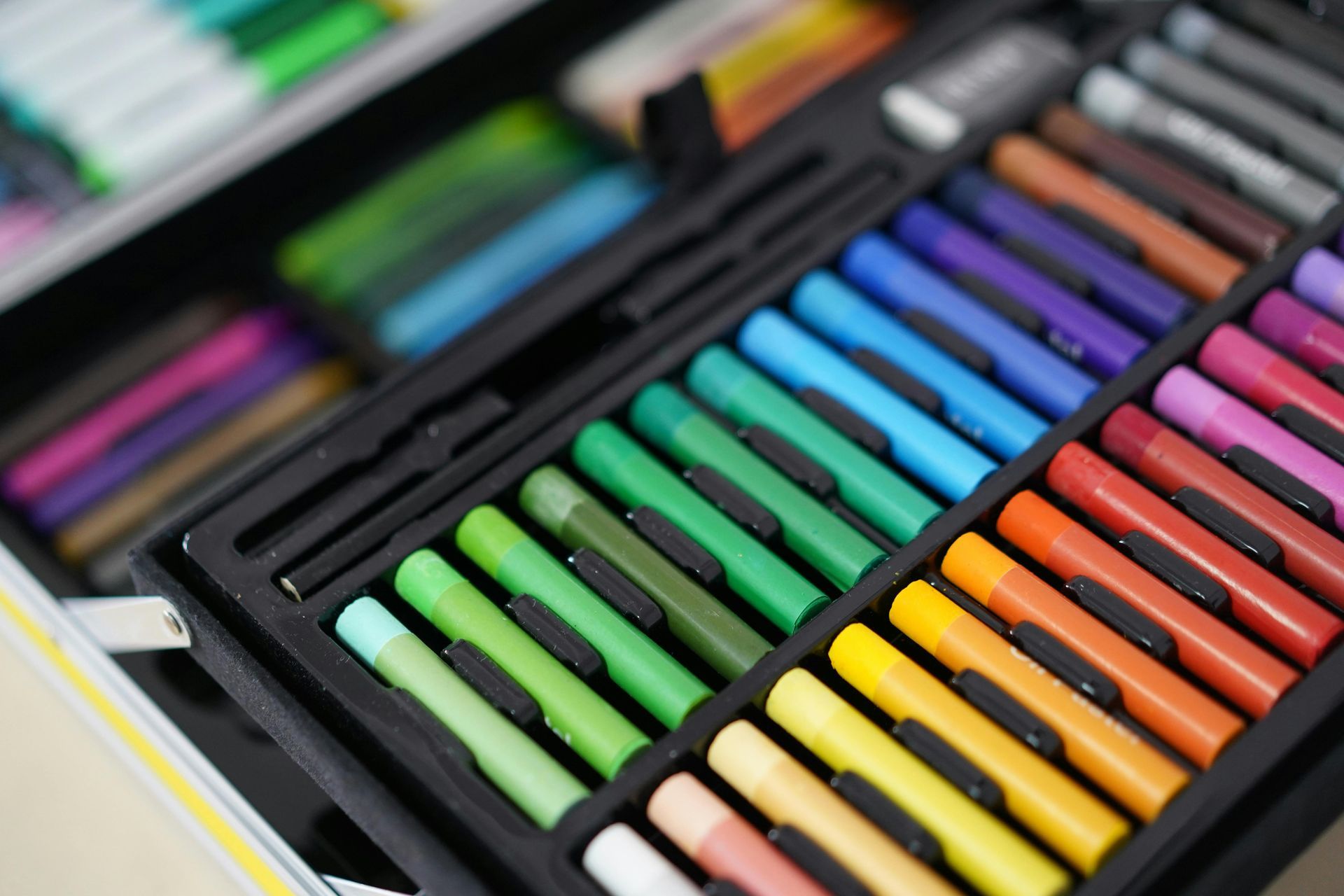
3. Choose Your Typography
Typography — the fonts you use and how you use them — shapes how people experience your content before they've consciously registered it. The right fonts reinforce your brand's personality. The wrong ones undermine it, no matter how good the content is. A good brand typography system is simple: usually just two fonts used consistently everywhere.
✅ Choose a heading font that expresses your brand's personality. Your heading font is your most expressive typographic choice — it's the first thing people read and the one that most strongly communicates your brand's tone. Serif fonts (with small strokes at the ends of letters) feel established, editorial, and classic. Sans-serif fonts feel modern, clean, and accessible. Script or display fonts feel distinctive and personal, but should be used sparingly. Choose one that fits your brand words from step one.
✅ Choose a body font that's clean and highly readable. Your body font will carry the bulk of your text — descriptions, bios, blog posts, emails, brochure copy. It needs to be easy to read at small sizes, on screens, and in print. Stick to clean, proven sans-serif or readable serif fonts for body copy. Avoid anything decorative or stylized for running text — legibility always wins.
✅ Make sure your heading and body fonts work well together. A good pairing creates visual hierarchy without feeling mismatched. Common successful approaches include: a serif heading font paired with a sans-serif body font (classic contrast), two sans-serif fonts from the same family in different weights (clean and cohesive), or a distinctive display font for headings paired with a very neutral body font (expressive but readable). Avoid pairing two highly stylized fonts — they'll compete.
✅ Browse and download free professional fonts at Google Fonts. Google Fonts is a free library of hundreds of high-quality, professionally designed typefaces that are licensed for commercial use — meaning you can use them in client-facing materials, on your website, and in print without licensing fees. You can filter by category, preview text in any font before choosing, and download any font directly. Many of the most widely used professional typefaces are available here.
✅ Define how you'll use each font across your materials. Document your typography choices with clear usage rules: which font is used for main headings, which for subheadings, which for body text, and which (if any) for captions or labels. Include size guidance where helpful — for example, headings at 32–48px on web, body at 16px minimum. This documentation becomes the reference your whole brand operates from.
✅ Limit yourself to two fonts — three at the absolute maximum. One of the most common branding mistakes is using too many fonts. It looks amateur and makes your materials feel inconsistent. Two fonts — one for headings, one for body — is almost always enough. If you want a third, it should serve a very specific purpose (like a monospace font for code, or a script accent used only in the logo). More than three fonts is rarely justified.
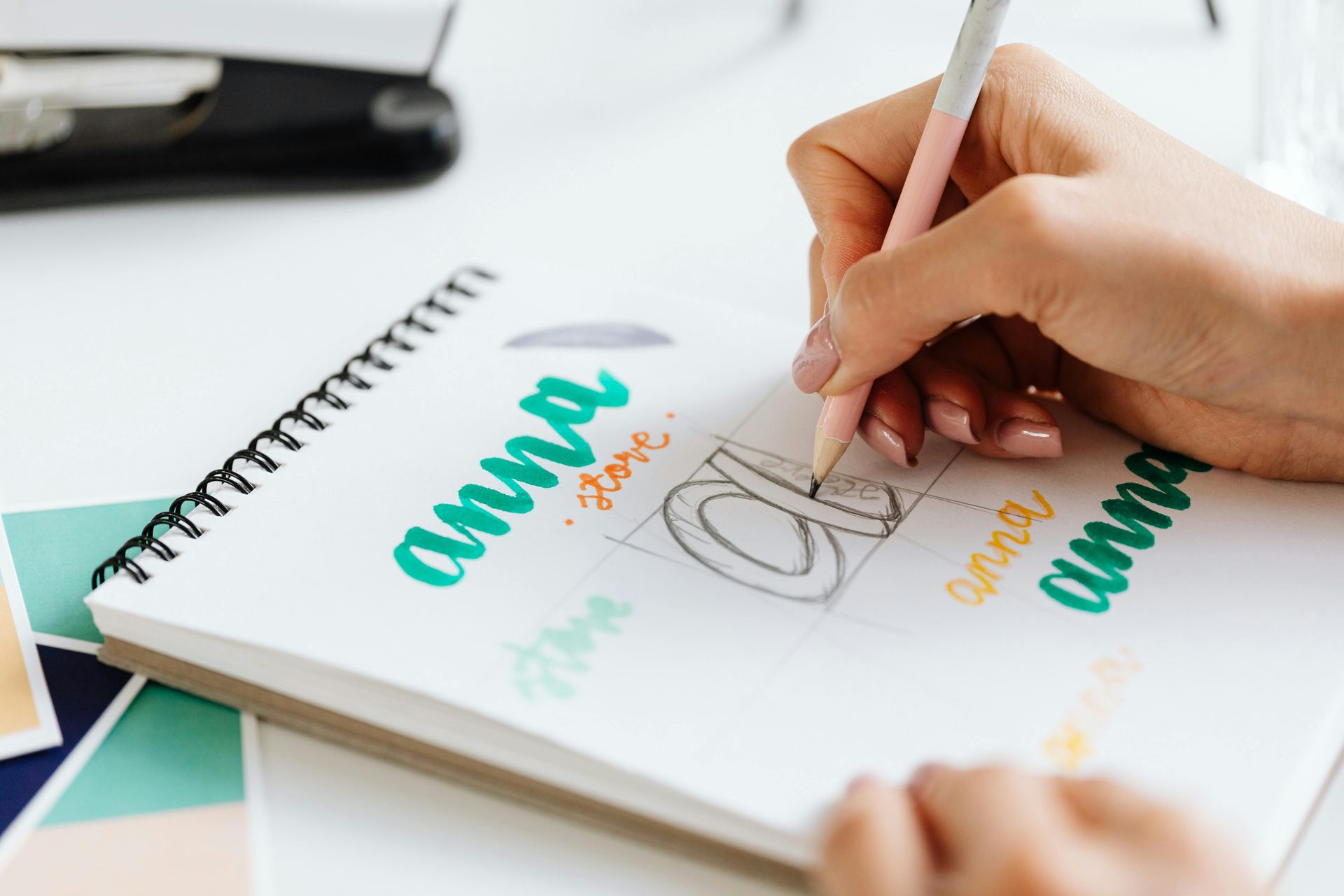
4. Design (or Refine) Your Logo
Your logo is the cornerstone of your visual identity — the one element that appears on virtually everything your business produces. It doesn't need to be complicated, but it does need to be versatile, readable, and reflective of your brand.
✅ Make sure your logo works in multiple formats and sizes. A good logo needs to work at large sizes (on a banner or website header) and small sizes (on a business card or app icon). Test your logo at a small size — if it's illegible or the detail is lost, it may need to be simplified. Your logo should also work in both full color and single-color (black or white) versions for situations where color printing isn't available.
✅ Get your logo in the right file formats. You need your logo in vector format (SVG or AI/EPS) for print and large-format use — vector files scale to any size without losing quality. You also need PNG versions with a transparent background for use on digital platforms, websites, and documents. If you only have a JPEG of your logo, it's time to get a proper file set together.
✅ Ensure your logo uses your brand colors and typography. Once you've defined your color palette and fonts, make sure your logo aligns with them. Your logo doesn't need to use every brand color, but it should feel like it belongs to the same visual family as the rest of your materials.
5. Create Templates for Every Platform
This is where your brand system becomes real. Templates are pre-built, branded files for every type of material your business produces regularly. Instead of starting from scratch every time — and making slightly different design decisions each time — you start from a template that already looks great and simply swap in the content. The result is a consistent, professional look across everything you put out, with a fraction of the effort.
✅ Use Canva to build and store all your branded templates. Canva is a free (with paid options) design platform that makes it easy to create professional templates for virtually any format — social media posts, email headers, presentations, brochures, business cards, and more. You can set up your brand colors and fonts inside Canva so they're available across every template you create. Canva's template library is also a useful starting point — find a layout you like, then swap in your own colors, fonts, and content to make it yours.
✅ Build a social media post template for each platform you use. Each platform has its own dimensions: Instagram feed posts are typically 1080x1080px (square) or 1080x1350px (portrait), stories are 1080x1920px, LinkedIn posts are 1200x627px, and so on. Create at least one on-brand template for each platform you post on regularly — a simple layout that includes your brand colors, fonts, and logo placement. Having these ready means every post you publish looks intentional and consistent.
✅ Create an email newsletter or marketing email template. If you send emails to customers — newsletters, promotions, announcements, follow-ups — they should look like they come from the same business as your website. Build a simple email template in Canva (or in your email marketing platform) with your logo in the header, your brand colors, your typography, and a consistent layout. Consistent emails look professional and reinforce brand recognition with every send.
✅ Build a presentation template. Whether you're pitching a client, presenting at an event, walking a customer through a proposal, or sharing a recap internally — you need a branded presentation template. Build a slide deck in Canva (or Google Slides or PowerPoint) with your brand colors, fonts, logo, and a set of consistent slide layouts: a title slide, a content slide, a section divider, and a closing slide. You'll use this more than you think.
✅ Create a brochure or one-pager template. A simple branded one-pager — a single-page document you can hand out, email as a PDF, or print for events — is one of the most versatile marketing tools a small business can have. It can serve as a services overview, a pricing sheet, a capabilities summary, or a leave-behind after a meeting. Build it once in Canva, save it as a template, and update the content as your offerings evolve.
✅ Design a business card template. Business cards remain one of the most effective networking tools for small businesses. Make sure yours reflects your current brand — your logo, brand colors, fonts, and clean layout. Include your name, title, website, email, and phone number at minimum. Canva has print-ready business card templates and can connect you directly to print services.
✅ Create a proposal or quote document template. If you send proposals, quotes, or scopes of work to clients, those documents are a brand touchpoint too. A branded proposal — with your logo, colors, and clean typography — looks more credible and professional than a plain Word document. Build a template that you can duplicate and fill in for each new client.
6. Apply Your Brand Consistently Across Every Touchpoint
Building the system is only half the job. The other half is using it consistently — every time, on every platform. Consistency is what turns a set of visual elements into a recognizable brand. One off-brand email or presentation can quietly undermine the credibility you're building everywhere else.
✅ Create a simple brand style guide and share it with anyone who works with you. A brand style guide doesn't need to be a 40-page document. A one or two-page PDF that shows your logo variations, color palette with hex codes, font choices and usage, and a few examples of on-brand design is enough for most small businesses. Share it with any contractors, virtual assistants, or collaborators who create materials on your behalf. It removes guesswork and keeps everything consistent even when you're not the one designing it.
✅ Audit your existing materials and update anything that's off-brand. Once you've defined your brand system, do a full audit of what's currently out in the world: your website, your social profiles, your email signature, your printed materials, your proposals. Identify anything that doesn't align with your new brand system and update it. An inconsistent brand is confusing to customers — even if they can't articulate why.
✅ Update your email signature to reflect your brand. Your email signature is a small but frequently seen brand touchpoint. At minimum it should include your name, title, business name, website URL, and phone number. A simple logo inclusion can make it feel more polished. Keep it clean — a cluttered signature with too many elements and a wall of links does more harm than good.
✅ Make sure your social media profiles are consistently branded. Every social profile you maintain should use the same profile photo (typically your logo), consistent cover images where applicable, and the same handle or username across platforms where possible. Your bio should describe your business clearly and consistently. A prospective customer who finds you on Instagram and then visits your website should immediately feel like they're in the same place.
✅ Use the same tone of voice alongside your visual brand. Brand consistency isn't only visual — it's verbal too. The way you write your website copy, your social captions, your email subject lines, and your client communications should all feel like they come from the same person with the same personality. Decide whether your brand voice is formal or casual, warm or direct, playful or serious — and apply it consistently across everything you write.
7. Maintain and Evolve Your Brand Over Time
A strong brand isn't static — it grows and evolves as your business does. But evolution should be intentional, not reactive. The goal is to stay fresh without losing the recognition you've built.
✅ Review your brand annually. Set a once-a-year reminder to evaluate how your brand is showing up. Is it still aligned with your business direction? Does it still resonate with your target audience? Does it feel current, or has it started to look dated? You don't need a full rebrand every year — but regular evaluation keeps you from drifting without realizing it.
✅ Make changes intentionally and update everything at once. If you decide to refresh your colors, update a font, or refine your logo, don't do it halfway. Update all your templates, your website, your social profiles, and your printed materials at the same time — or at least within a short window. A partial rebrand is more confusing than either staying put or fully committing to the change.
✅ Keep your brand files organized and backed up. Store all your brand assets — logo files, font files, color swatches, templates — in one organized folder, backed up in cloud storage. Name files clearly (Logo_Primary_Color.svg, Logo_White.png, BrandGuide_2026.pdf) so you can always find what you need quickly. Losing your logo source files or your templates is a headache you can easily avoid.
Building a Brand That Works for You
A cohesive, professional brand doesn't require a big team or a large budget. It requires clarity, intentionality, and consistency. When you define your colors, choose your fonts, build your templates, and apply them consistently across every platform — digital and print — your business starts to look and feel like a credible, established operation, no matter how big or small you actually are.
That consistency is what makes customers trust you before they've even spoken to you. It's what makes your emails worth opening, your social posts worth following, and your proposals worth signing. It compounds over time — and it starts with the decisions in this checklist.
If you'd like professional help building a brand identity from the ground up — or refreshing the one you have — Divscape offers branding packages designed specifically for small businesses. From logo design and color palettes to font pairings and custom templates, we'll give you a complete brand system that works everywhere you need it to.
Branding packages start at $150. Book a free consultation to talk through what your business needs.
Recent Posts