How to Use Color Psychology to Build a Stronger Brand

Taryn Parsons • April 29, 2026

Share this article

Before a potential customer reads your tagline, clicks your CTA, or even registers your business name, they've already formed an impression — and color is doing most of the heavy lifting. Research consistently shows that color accounts for a significant portion of snap judgments people make about products and brands. For small business owners building a brand from scratch (or reassessing one that isn't quite landing), understanding color psychology isn't just useful — it's essential.

The good news is that you don't need a design degree to make smart color decisions. You just need to understand the emotional signals different colors send, how they interact with each other, and how to apply them consistently across your brand. This post breaks it all down in plain language, with practical guidance you can actually use.

1. Why Color Is One of Your Brand's Most Powerful Tools

Color communicates before words do. When someone lands on your website, sees your logo, or picks up your business card, their brain processes color almost instantly — and assigns meaning to it just as fast. That meaning is partly cultural, partly instinctive, and heavily shaped by what people already associate with similar businesses in your industry.

Think about the brands you recognize immediately just from their color: the warm red of a fast food giant, the clean blue of a major bank, the earthy tones of an organic food brand. Those choices aren't accidental. They're the result of deliberate decisions about what emotions and associations the brand wants to trigger. Your small business deserves the same intentionality.

Color also plays a direct role in buying decisions. When used consistently, the right palette builds recognition over time — so that even without your logo visible, people start to associate your specific shade of teal or navy with your business. That kind of brand recognition is hard-won and enormously valuable, especially in competitive local markets.

The bottom line: color isn't decoration. It's communication. And when you choose your brand colors strategically, you're giving yourself a powerful, silent sales tool that works 24/7 — on your website, your packaging, your social media, and everywhere else your business shows up.

2. What Different Colors Actually Signal

Every color carries a general emotional weight. These associations aren't absolute — context, shade, and surrounding colors all matter — but they're a useful starting point for thinking about what you want your brand to feel like. Here's a plain-language breakdown of the most common brand colors and what they tend to communicate.

Blue is the most widely used color in professional branding for good reason. It signals trust, reliability, calm, and competence. It's a natural fit for financial services, healthcare, tech, legal, and any business where credibility is the top priority. The specific shade matters though — a bright cobalt feels modern and energetic, while a deep navy reads as established and authoritative.

Green is strongly associated with nature, health, growth, and sustainability. It works well for wellness brands, outdoor businesses, organic or eco-conscious products, and financial brands (where it connects to prosperity and stability). Lighter greens feel fresh and gentle; deeper greens feel grounded and premium.

Red commands attention and creates urgency. It's energetic, bold, and emotionally stimulating — which is why it's used heavily in food, retail, and entertainment. Red can drive action, but it can also feel aggressive if overused. In branding, it works best as an accent or primary color for brands that want to convey passion, confidence, or excitement.

Yellow and orange are warm, optimistic, and high-energy. Yellow evokes cheerfulness and creativity; orange adds warmth and approachability. Both work well for brands that want to feel friendly, accessible, and fun — think creative agencies, children's services, food businesses, and lifestyle brands. These colors demand careful use though — they can feel overwhelming at high saturation.

Black, white, and gray are the workhorses of branding. Black signals sophistication, luxury, and authority. White conveys simplicity, cleanliness, and openness. Gray sits comfortably between the two — neutral, professional, and versatile. Most brands use these as their base, pairing them with one or two accent colors to carry the emotional weight.

Purple has long been associated with royalty, creativity, and wisdom. It feels distinctive and a little unexpected in many industries, which can work in your favor if you want to stand out. It's a strong choice for beauty, wellness, coaching, and creative businesses.

3. How to Choose Colors That Fit Your Brand

Knowing what colors mean is only half the equation. The other half is figuring out which colors are right for your specific business, audience, and goals. Here's a simple framework to guide the decision.

Start with your audience, not your personal taste. The colors you personally love may not be the ones your customers respond to. Think about who your ideal customer is, what they care about, and how they want to feel when they interact with your brand. A wedding planner serving a luxury clientele will have a very different color conversation than one serving budget-conscious couples — even if the same person runs both businesses.

Look at your industry — then decide whether to fit in or stand out. Most industries have color conventions, and there's a reason they exist. Customers in those spaces have been trained to associate certain colors with certain types of businesses. Fitting in can build immediate trust; standing out can make you memorable. The right answer depends on your positioning. If you're the premium option in a sea of generic competitors, going against the grain visually can be a real differentiator.

Choose a primary color, one or two secondaries, and neutrals. Most effective brand palettes are built around a primary color that carries the main emotional message, one or two secondary colors that complement and add variety, and neutral tones (typically black, white, or gray) that provide breathing room. More than four or five colors starts to feel chaotic and hard to use consistently.

Test your palette across contexts. A color that looks great on a white background might disappear on a dark one. A combination that works beautifully in print might clash on a screen. Before you commit to a palette, test it across the surfaces where it will actually live — your website, your social media templates, your email header, any print materials. Ask yourself: does this still feel cohesive and intentional in every context?

4. Applying Your Colors Consistently Across Your Brand

Choosing the right colors is step one. Using them consistently is where the real brand equity gets built. Inconsistent color use — even with great individual colors — creates a fragmented impression that undermines credibility and makes your business harder to recognize over time.

A solid brand kit is the foundation of color consistency. At minimum, your brand colors should be documented with their exact hex codes (for digital use), RGB values, and CMYK values (for print). This means that whether you're updating your website, posting on Instagram, or handing something off to a printer, you're always working with the exact same colors — not "close enough."

Apply your palette with intention, not just uniformly. Your primary brand color should be prominent but not overwhelming. Reserve your accent colors for moments where you want to draw attention — a CTA button, a key headline, an icon. Neutrals do the heavy lifting in backgrounds and body text. When everything is the same color, nothing stands out. The hierarchy in your palette should create a visual hierarchy in your designs.

If you work with freelancers, printers, or social media managers, share your brand guidelines with everyone who touches your visual materials. Consistency across all your touchpoints — not just the ones you control directly — is what turns a color palette into a recognizable brand identity.

Ready to Build a Brand That Actually Works?

Color psychology is one piece of a larger puzzle. A truly effective brand combines the right colors with the right logo, typography, and visual language — all working together to communicate who you are and connect with the people you're trying to reach. When it's done well, your brand does a significant amount of selling before a customer ever has a conversation with you.

At Divscape, our branding packages are built to give small businesses exactly this foundation. We create logo designs, color palettes, and font pairings that are strategically selected for your audience, your industry, and your goals — not just what looks nice. And because we also build websites, your brand can flow seamlessly from your visual identity straight into your online presence.

If you're ready to build a brand that looks like you mean business, explore our branding services or book a free consultation to talk through what your brand needs. We'd love to help you get it right.

Recent Posts

By Taryn Parsons May 27, 2026
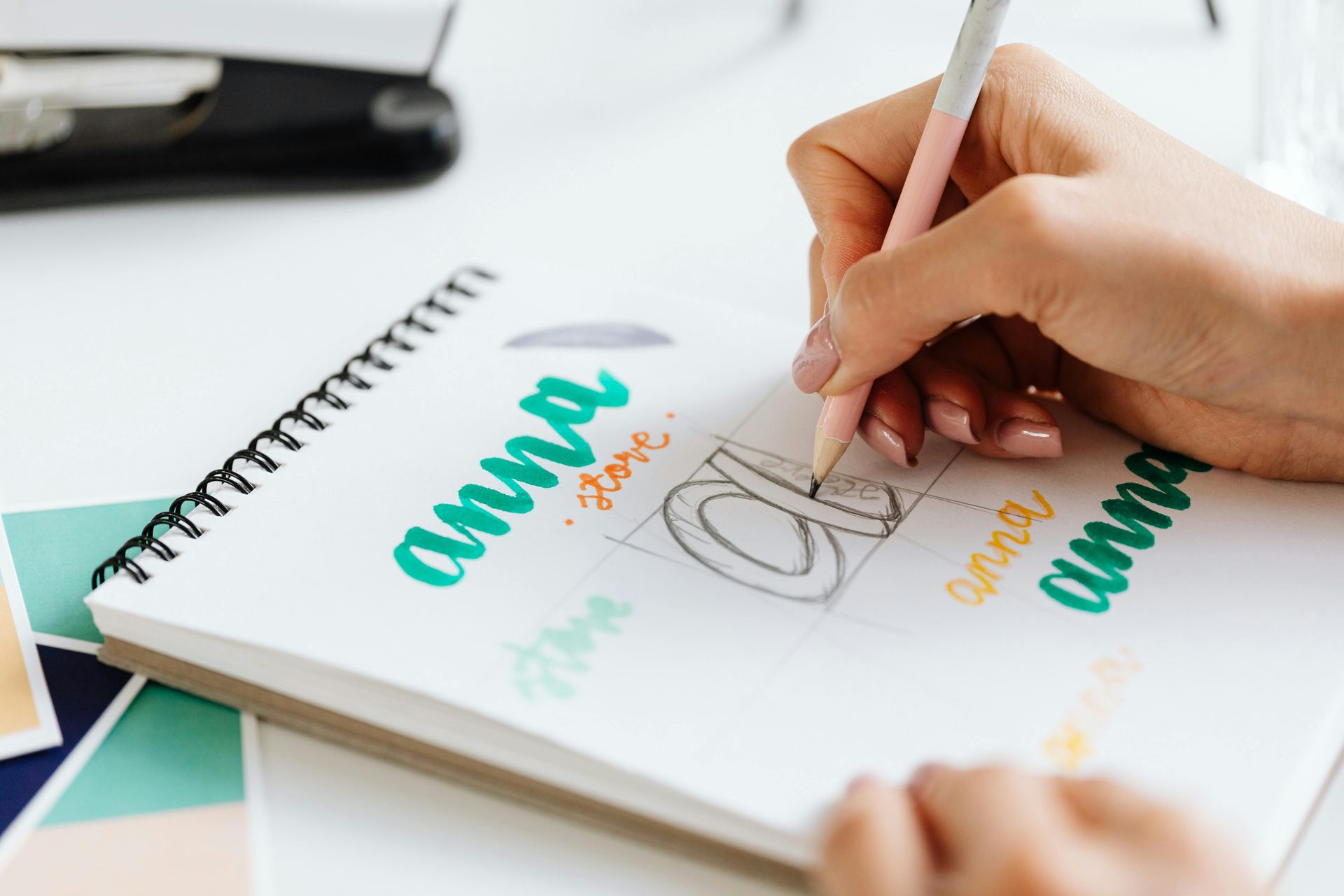
Your logo is the face of your brand. Learn modern logo design best practices — from choosing the right style to creating versions for every platform.
By Taryn Parsons May 20, 2026
Your Google Business Profile is one of the most powerful free tools available to small businesses. Here's how to set it up, optimize it, and keep it working for you in 2026.
By Taryn Parsons May 13, 2026
Too many tools slow your business down. Learn how to audit your tech stack, cut what you don't need, and build a leaner, smarter operation as a small business.
By Taryn Parsons May 6, 2026
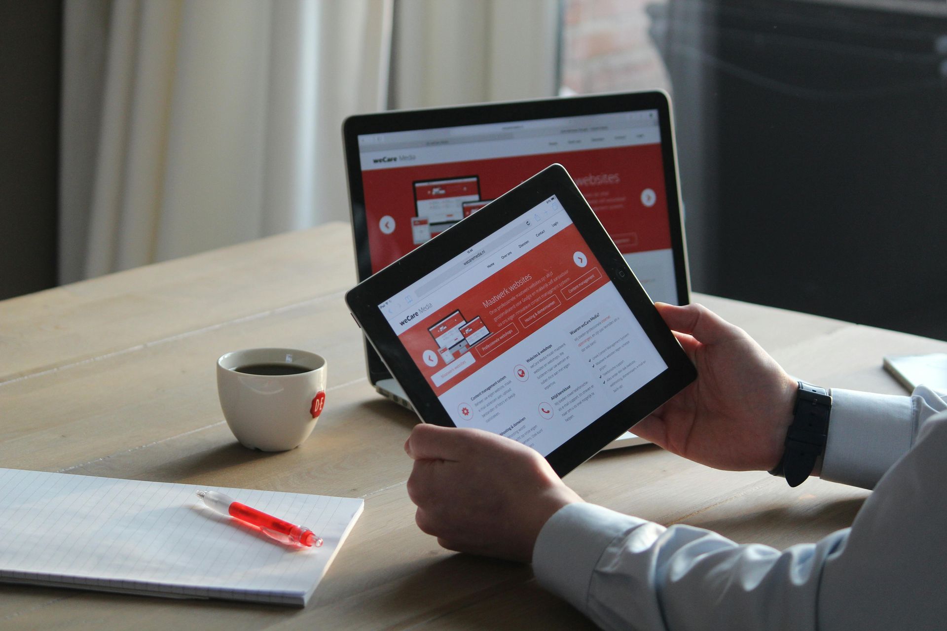
Duda vs WordPress, Squarespace, and Webflow — here's why Duda is the best website platform for small businesses looking for speed, ease of use, and low maintenance.
By Taryn Parsons April 22, 2026
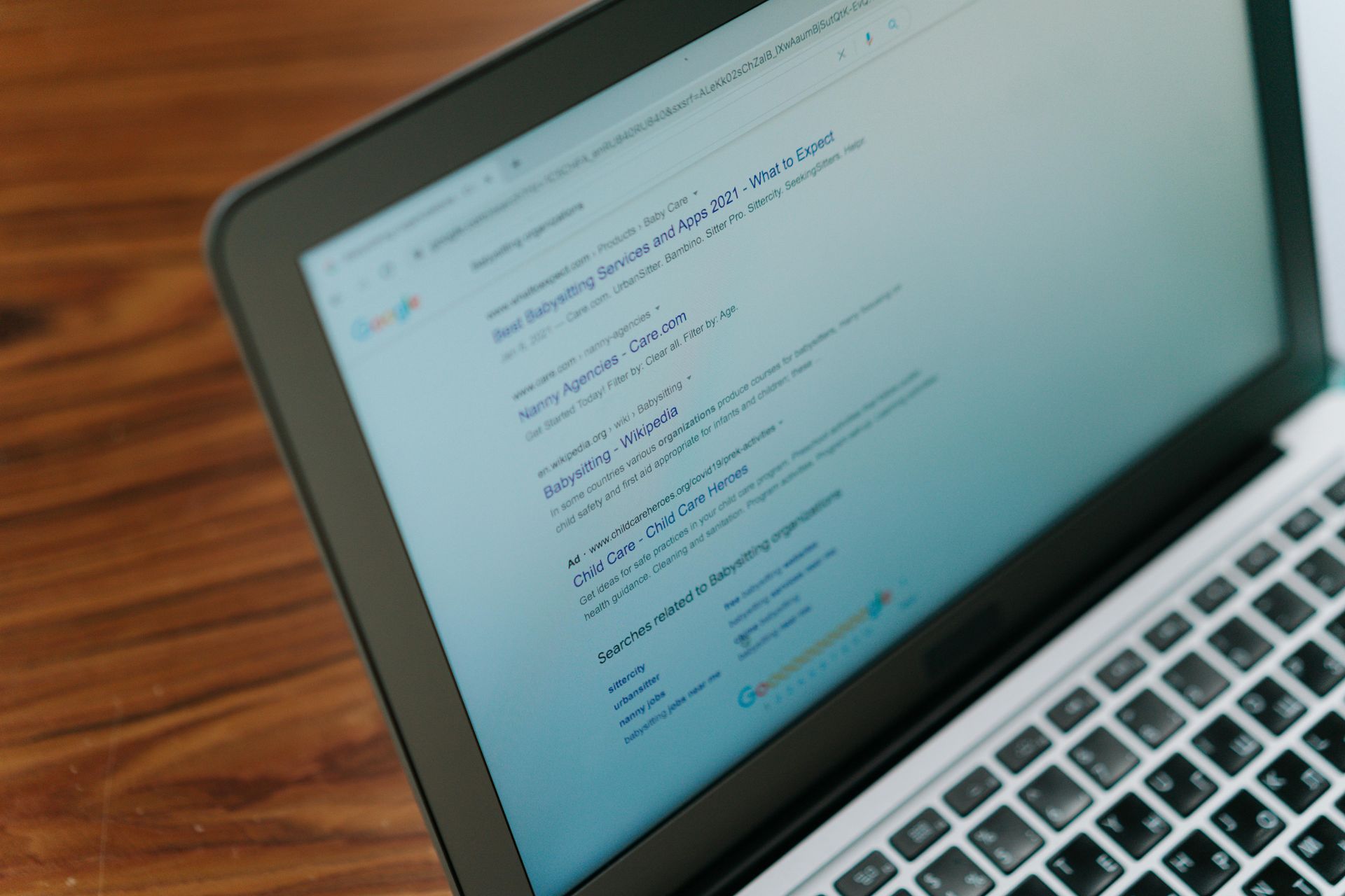
AI tools like ChatGPT, Gemini, and Perplexity are changing how people find businesses. Here's how to optimize your small business for AI-powered search in 2026.
By Taryn Parsons April 15, 2026
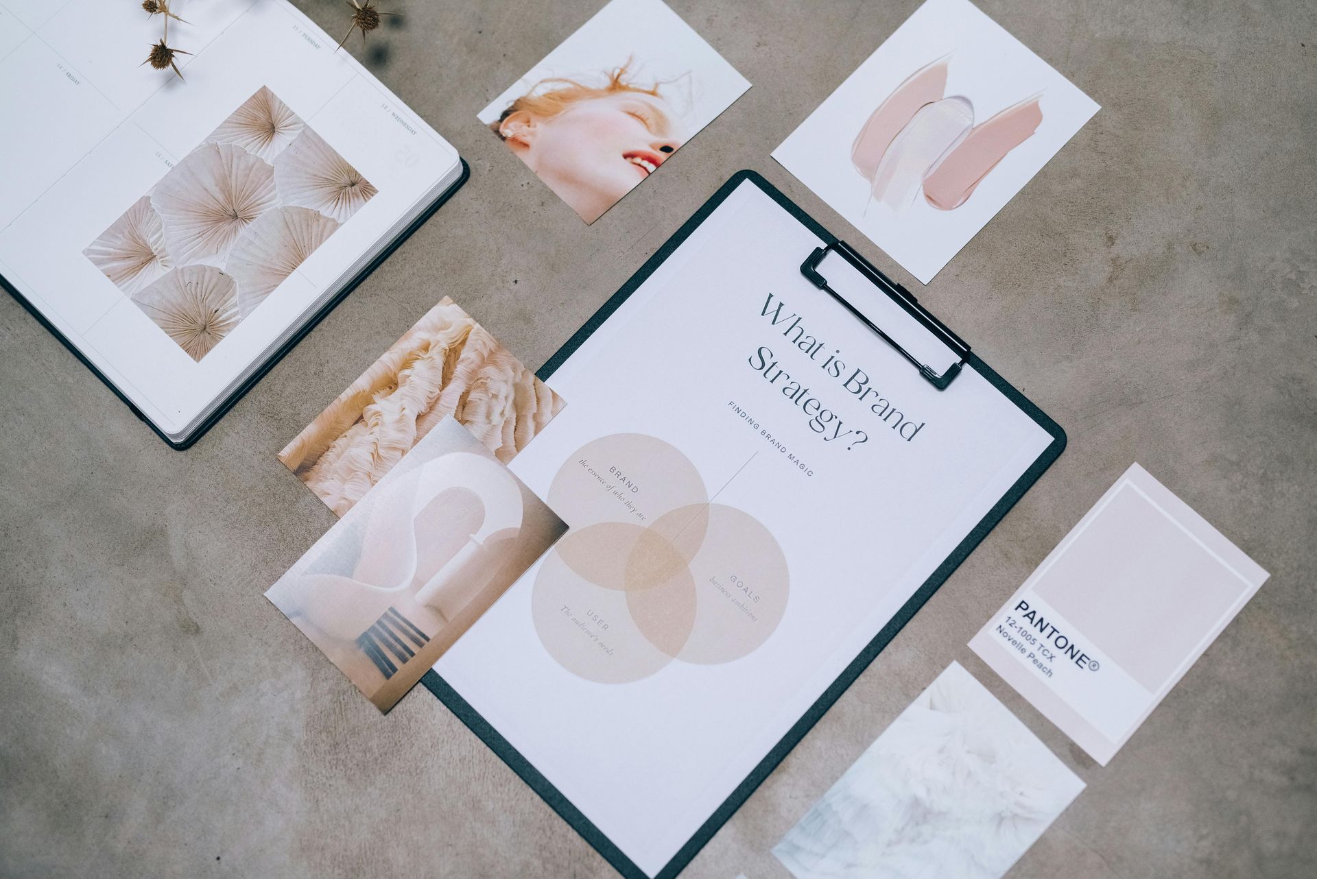
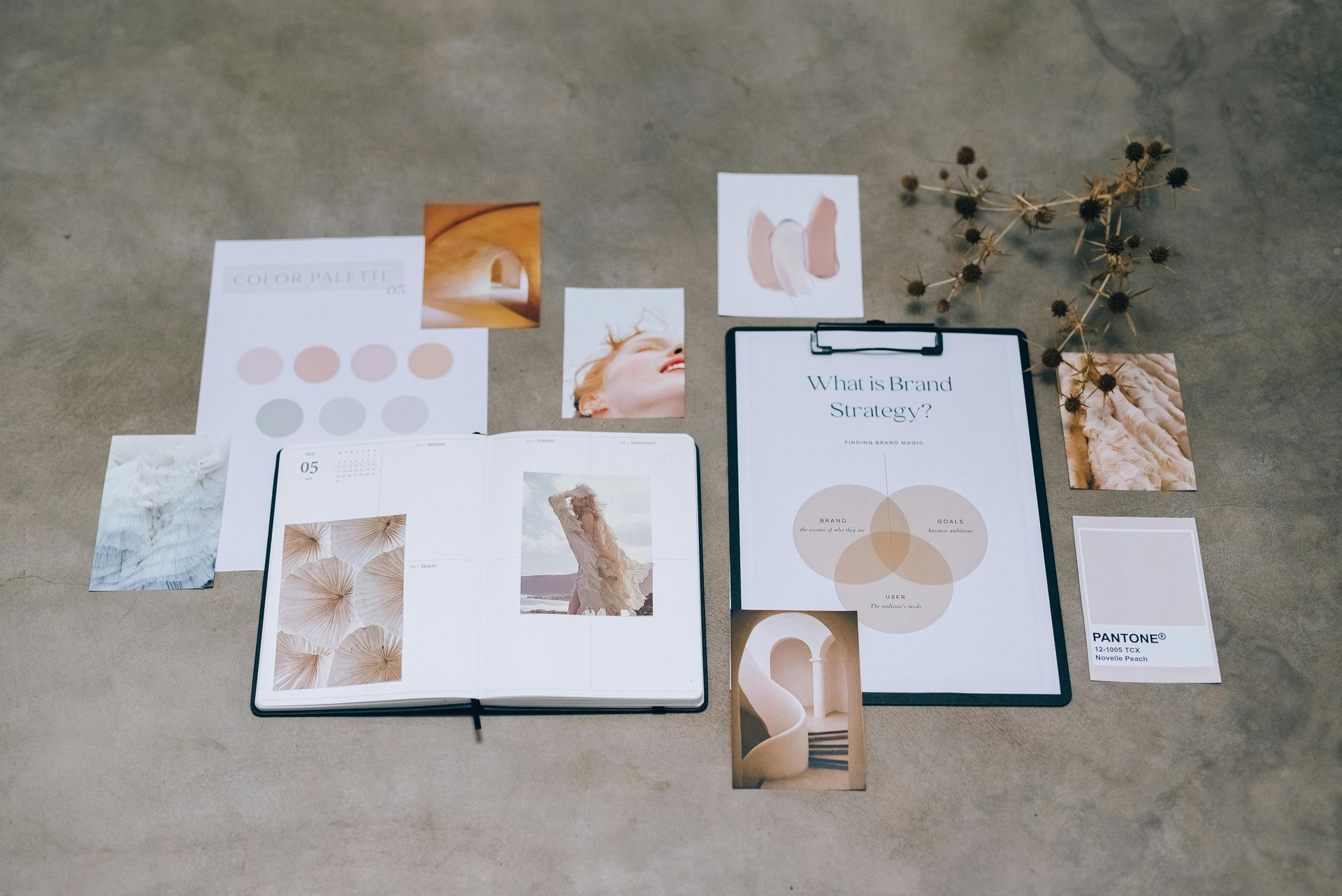
A practical checklist for small business owners on building a cohesive, professional brand across digital and print — from color palettes and fonts to templates and beyond.
By Taryn Parsons April 8, 2026
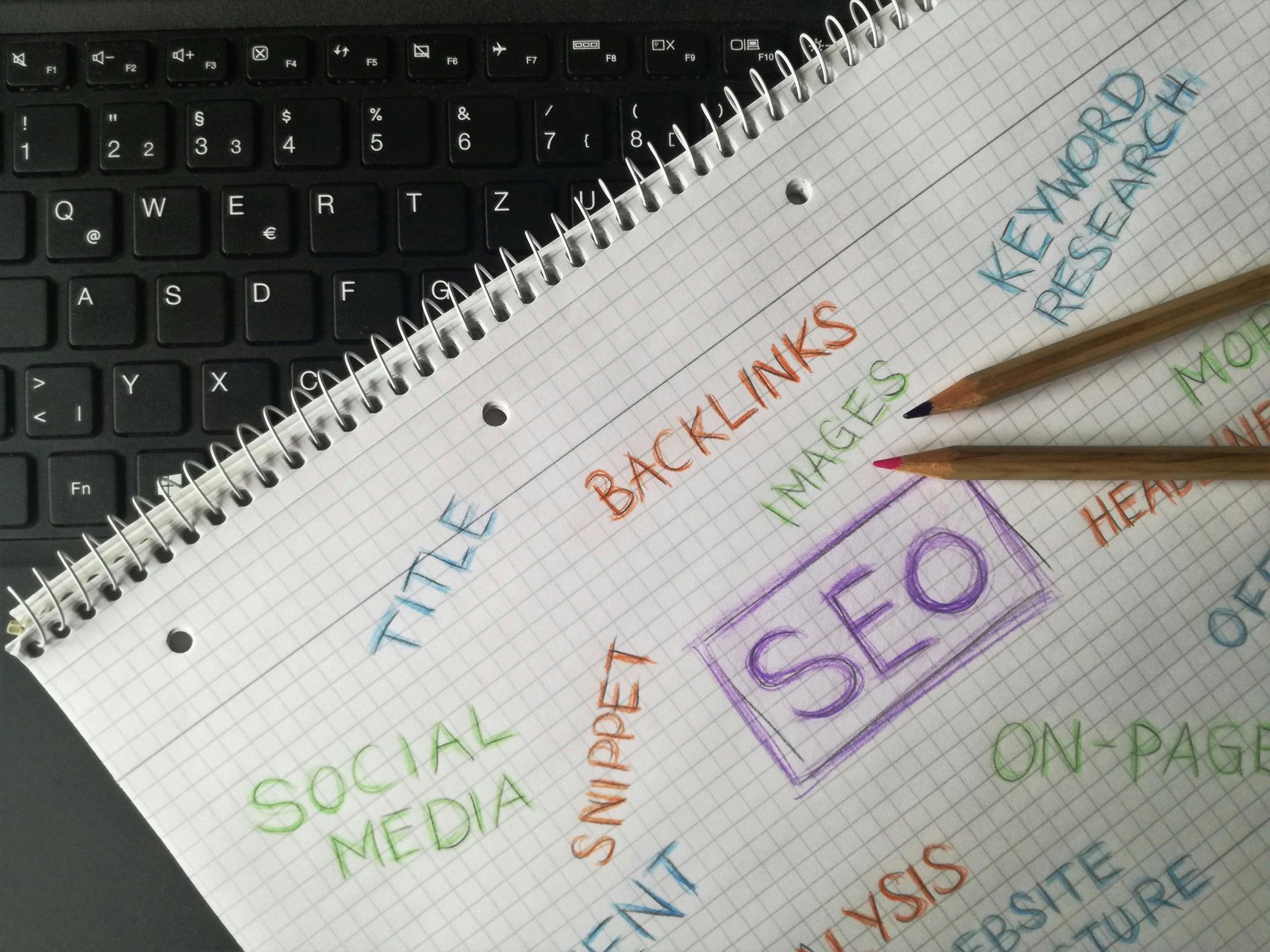
A practical 2026 checklist of essential website best practices for small businesses — covering performance, SEO, AEO, accessibility, privacy, conversion, and more.
By Taryn Parsons April 1, 2026
A practical 2026 checklist for small business owners covering website SEO, Google Business Profile, AI optimization, accessibility, privacy compliance, and more.